Context
The cart, checkout, and post-purchase email experience for one of APA’s e-commerce systems had gone unaddressed for some time. The work followed directly on the heels of a login-screen redesign handled by the same team, and it coincided with an organization-wide switch in payment processors. The prior processor relied on a non-responsive iframe embedded in the checkout screen, which was a known, recurring pain point for users trying to complete purchases on mobile. The new processor was more modern and integrated more cleanly into a redesigned experience, though the redesign itself was driven as much by outdated visual design and a desire to bring the experience in line with APA’s evolving design aesthetic as by the processor change alone.
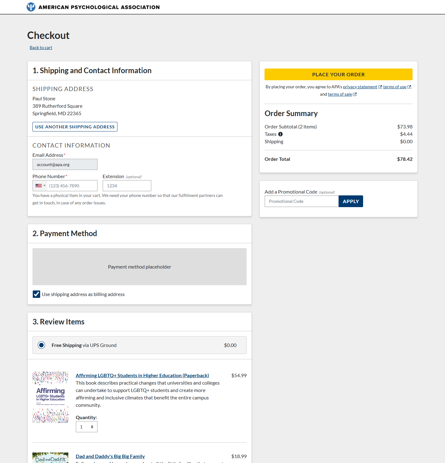
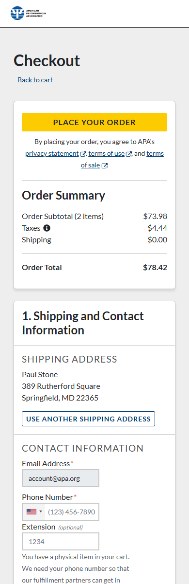
A note on the screenshots below
The payment step embeds a third-party processor widget (shown here as a gray placeholder in the mockups) — that widget, not this page, was the piece that used to be a non-responsive iframe.
Starting point
Unlike the Style Manual project, this wasn’t a zero-to-one build — it was a mature, revenue-generating system with an existing, if outdated, flow. The redesign wasn’t formally paired with the preceding login redesign, but grew naturally out of continued close collaboration with that same team. My scope was specifically the cart-through-confirmation experience and all associated transactional emails — not the product catalog or search.
Approach
The core design challenge was scale and combinatorial complexity: guest vs. member accounts, physical vs. digital vs. mixed carts, US vs. international orders, and an optional donation add-on, each of which could interact with the others. Rather than designing each combination independently, I established a single baseline flow — a non-logged-in user purchasing a physical item — chosen because it required the broadest set of fields and interactions and could serve as a structural framework. I then worked outward from that baseline, starting with a digital-product cart, and handled most other scenarios by adding, removing, or adjusting fields and alerts against that shared framework rather than starting over each time. This kept the system coherent and made the large number of variations tractable.
Key decisions
Address management
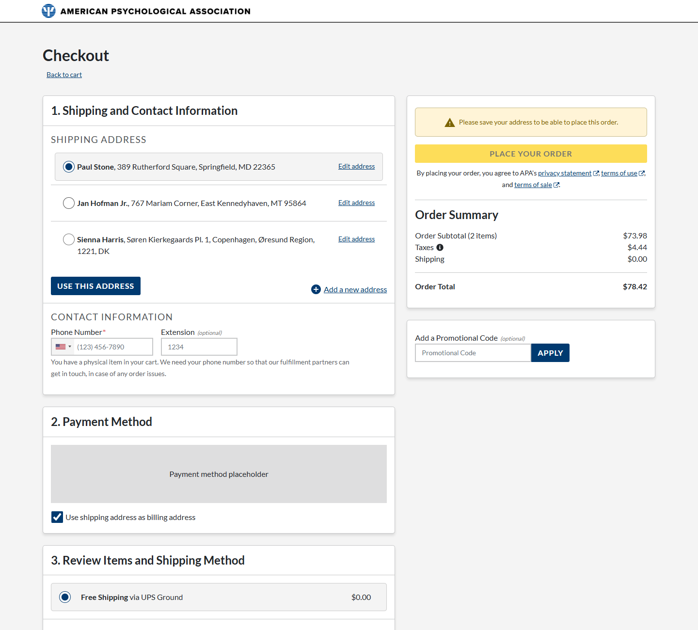
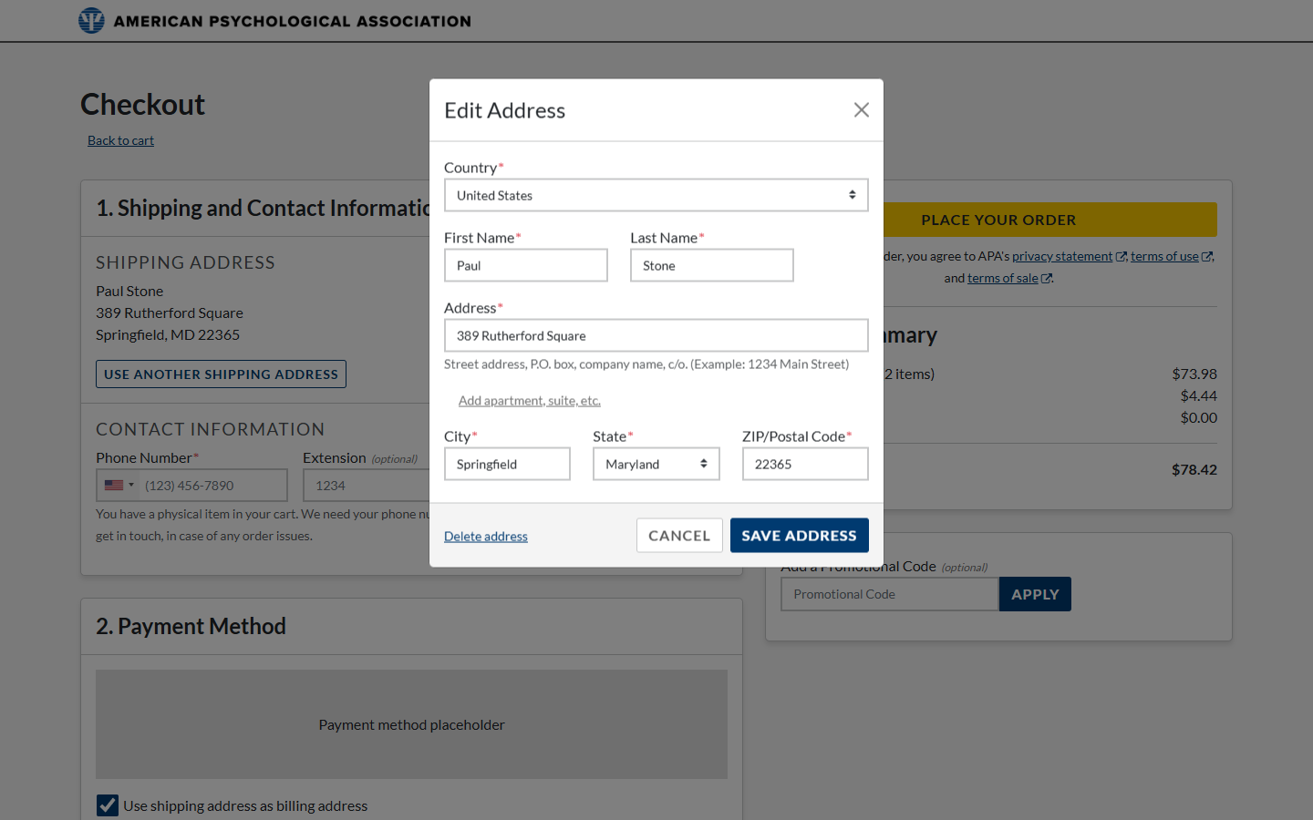
One of the more difficult problems was designing how logged-in users could view, select, add, and edit shipping and billing addresses already saved to their account within the checkout flow itself — requiring several rounds of back-and-forth with the team to get right. Elements of this work were significant enough that they were later incorporated into APA’s Pattern Library, extending their impact beyond this one project.
Scenario coverage
Systematically accounting for every combination of guest/member, physical/digital/mixed cart, US/international, and donation add-on — and making sure none were missed — was a core part of the design work.
Transactional emails
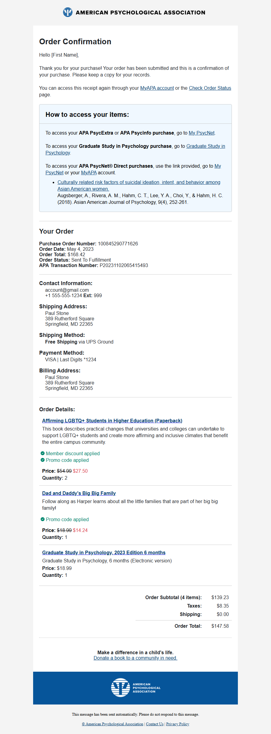
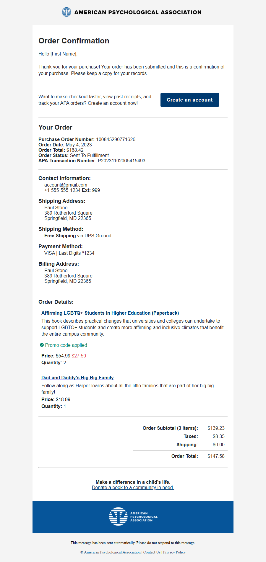
Each scenario required its own accurately informative email variant — for example, digital-product purchases needed clear access instructions, and donations needed to be handled and communicated distinctly from standard purchases. This was both a visual refresh and a content/logic exercise across the full scenario matrix, aimed at making sure every user came away fully informed regardless of what they’d purchased.
Collaboration & iteration
Because this project overlapped with an organization-wide payment processor migration, it had high visibility. I was in frequent design reviews with the development team, business stakeholders, the finance team, and at times c-suite leadership, given the scale of risk and change involved. This meant presenting designs early and often, asking direct questions when finance-side logic wasn’t clear to make sure it was reflected accurately in the user-facing experience, and iterating based on that cross-functional feedback. There was no formal end-user research on this project — validation came from this stakeholder feedback loop rather than direct usability testing, supplemented by competitive research into other e-commerce systems: looking at what worked well and what didn’t across common commerce patterns, then tailoring those findings to this specific scenario.
Launch & outcome
The redesign launched around June 2024. Beyond the immediate launch, a durable outcome was that several patterns developed for this project — particularly around address management — were incorporated into APA’s Pattern Library, extending the project’s impact into other products our team worked on.
Managing genuine complexity without letting it become chaos — imposing a coherent structure on a system with a large number of interacting variables.
Reflection
What stands out most about this project is managing genuine complexity without letting it become chaos: taking a system with a large number of interacting variables and imposing a coherent structure on it, rather than treating each scenario as a one-off. It also required a different register of stakeholder work — operating comfortably in high-visibility, cross-functional rooms with finance and executive stakeholders, translating unfamiliar business logic into clear design decisions, and doing enough upfront research into common commerce patterns to get the small details right.