Context
APA’s Style Manual has long been one of the dominant standards for academic writing and citation, historically distributed only in print and static digital formats. Other major style guides — including Chicago and MLA — had already moved to interactive online formats, and it was something users had specifically been asking for. That combination of factors led to the decision to take the Style Manual from a static reference into an interactive digital product.
Starting point
By the time I joined, the organization had already committed to a paid, institutionally-focused product and had begun early development on an e-reader platform to deliver it. What that platform could and couldn’t do was still being discovered. No UI, feature set, or user flow existed yet — that was the gap I was brought in to fill, working from a barebones e-reader shell toward a complete product experience.
Approach
Because the e-reader’s real technical limits weren’t fully known at the outset, I worked from an “ideal first, then adjust” approach: designing the experience I believed would best serve users, then working with developers to determine what was technically feasible and where the design needed to flex. This let design lead with user needs rather than being constrained prematurely by platform assumptions.
Over roughly six months, I delivered design work in two-week sprints, reviewing progress with developers, a project manager, and content/QA stakeholders after each cycle, and continued into hands-on UX review of the build itself, not just up-front designs.
Key decisions
Access and authentication
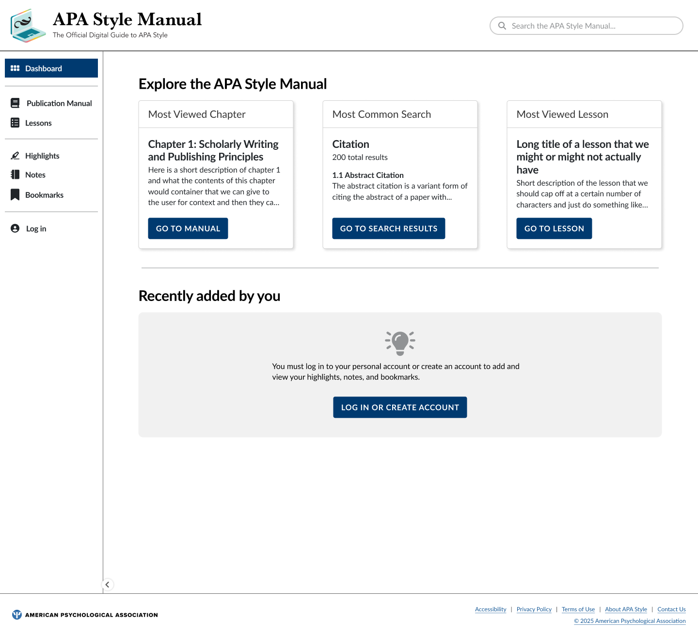
The product needed to support two very different access patterns — institutions whose users could authenticate automatically via IP address, and individual account holders logging in directly or through an institutional affiliation. Because personal tools like bookmarks, highlights, and notes required an account to persist, I designed distinct flows and empty states for users who arrived via institutional IP access but weren’t logged in, so the product remained clear and useful rather than presenting a confusing dead end.
Search
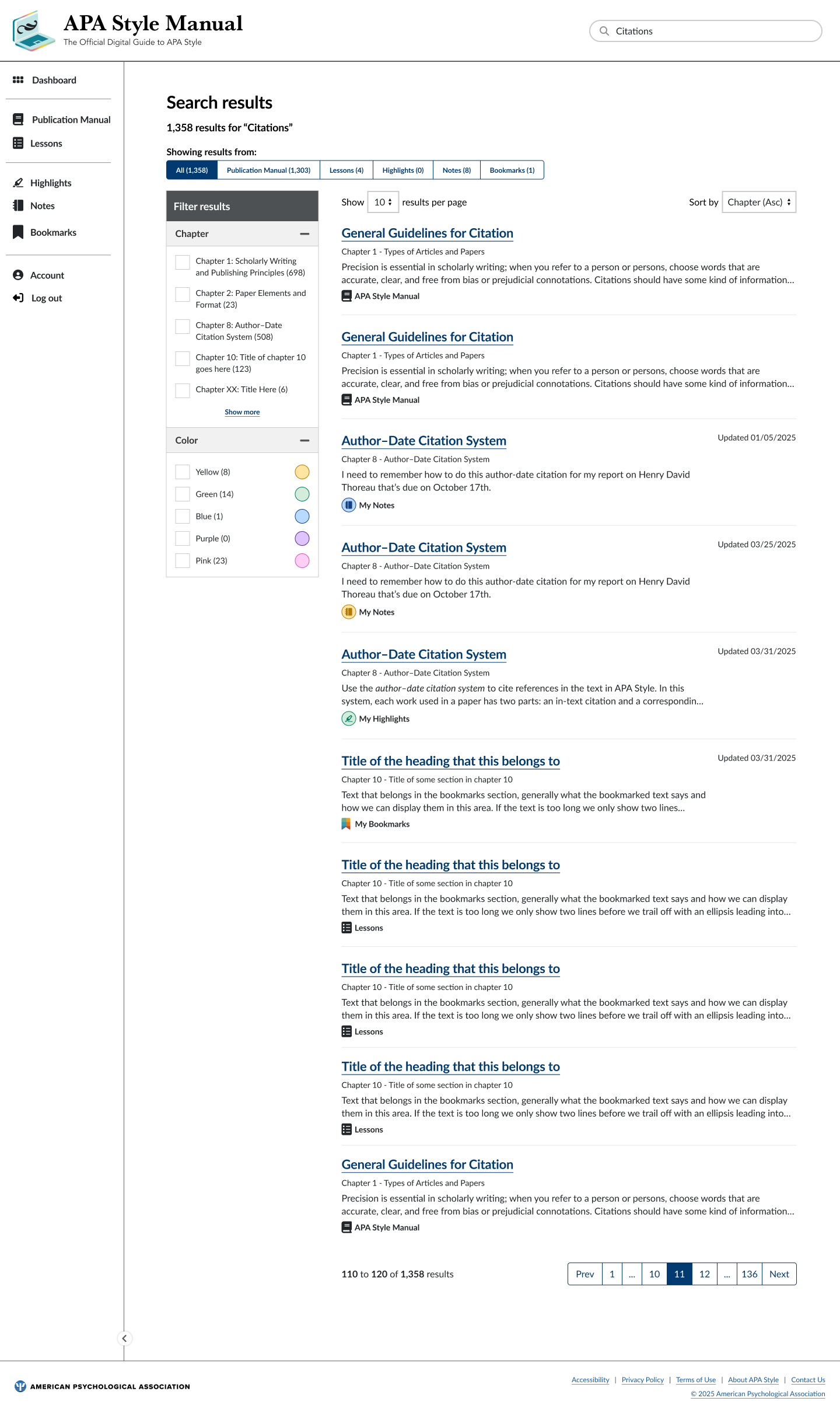
Search was a core way users found specific rules, citation formats, and examples within a large reference work. I designed the search results experience, including what metadata should surface for each result, while working within real technical limits on what content could be indexed and how matching worked.
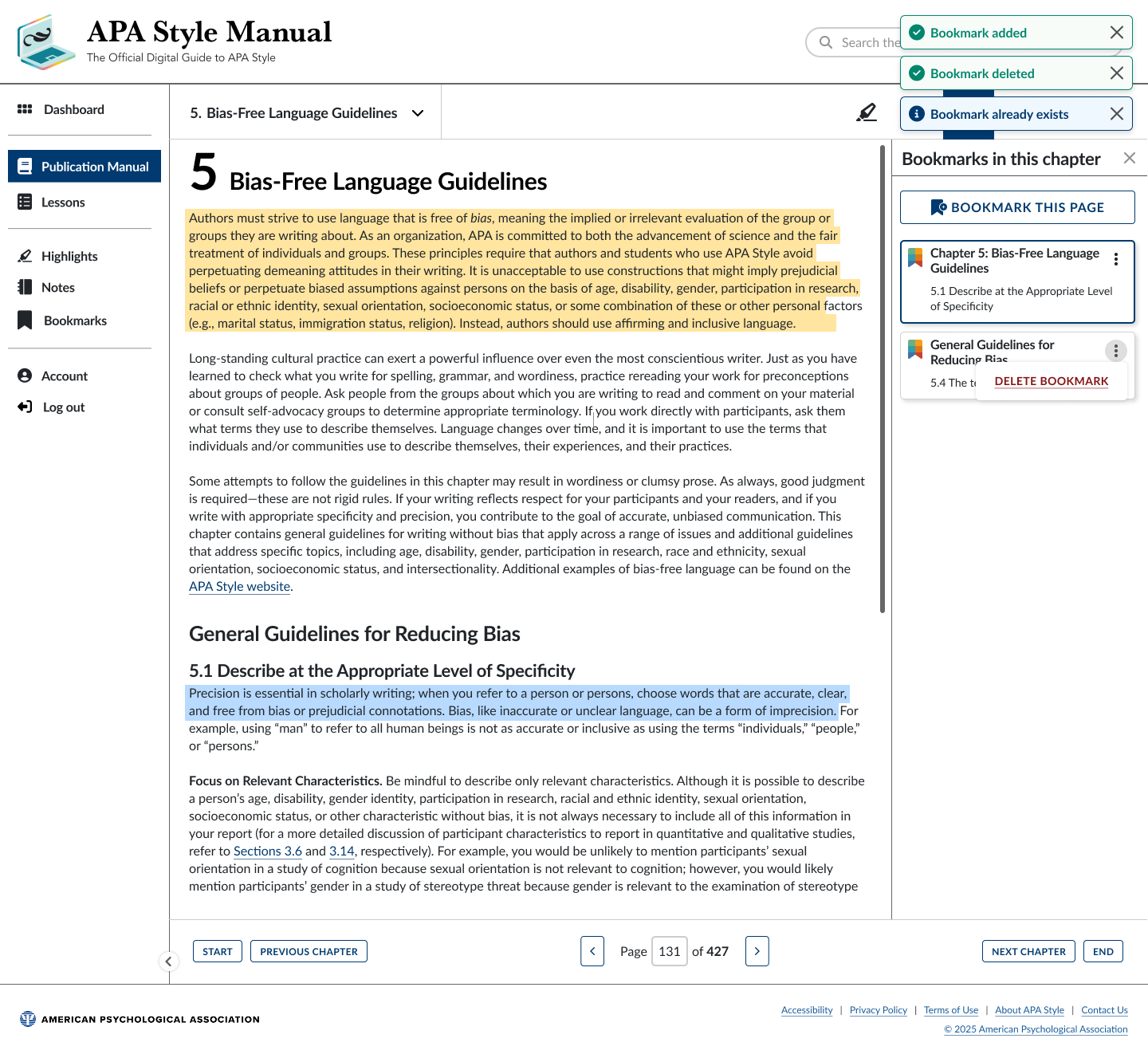
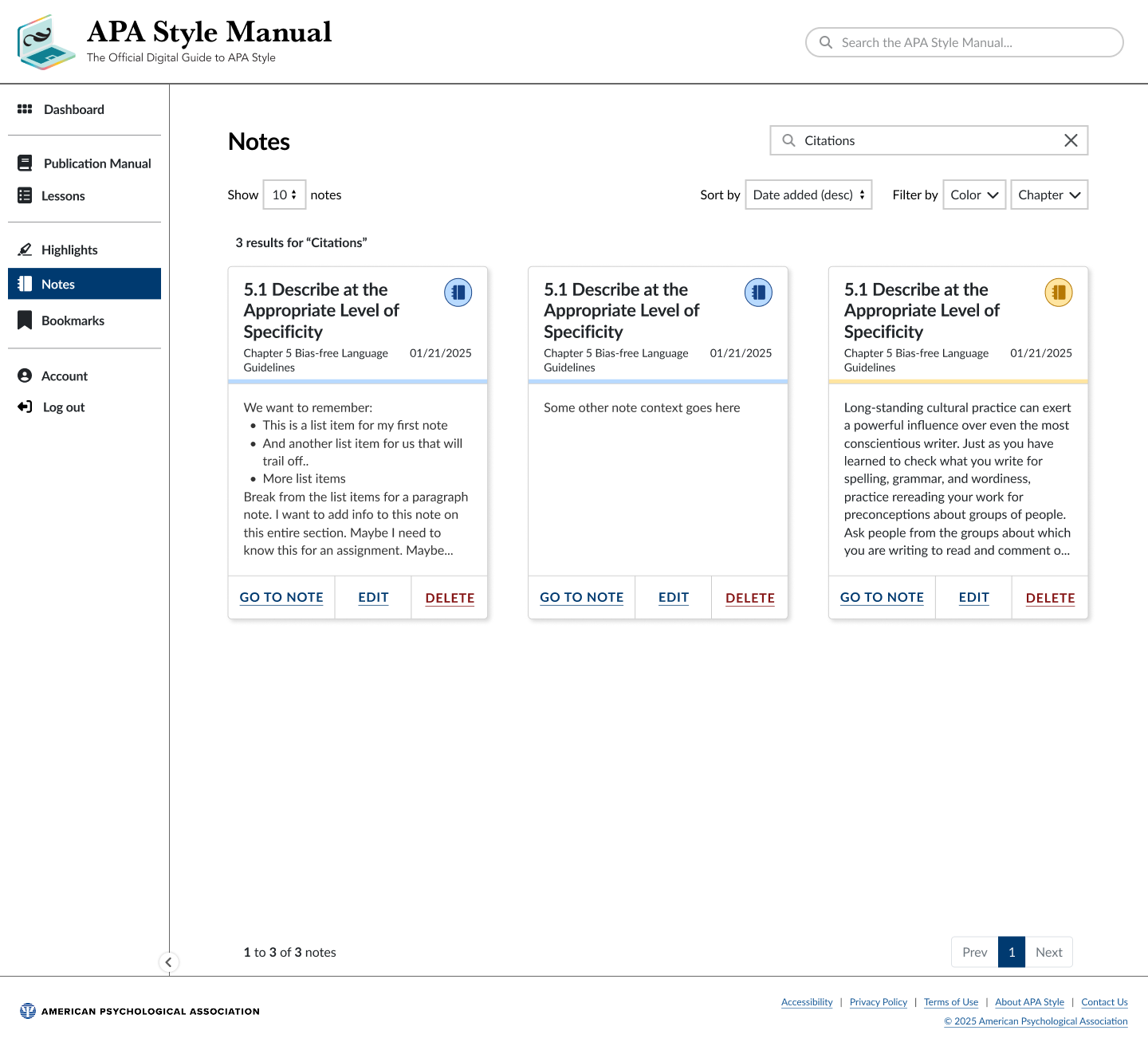
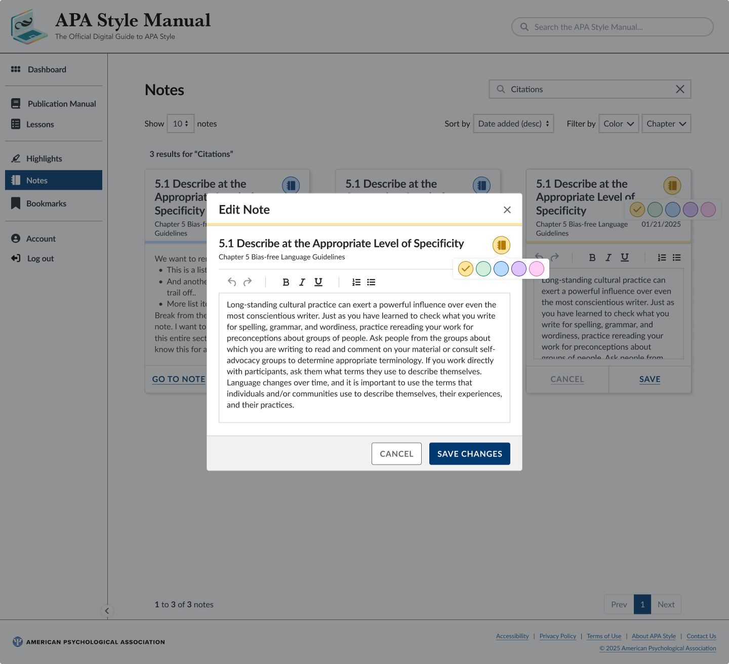
Personal tools — bookmarks, highlights, notes
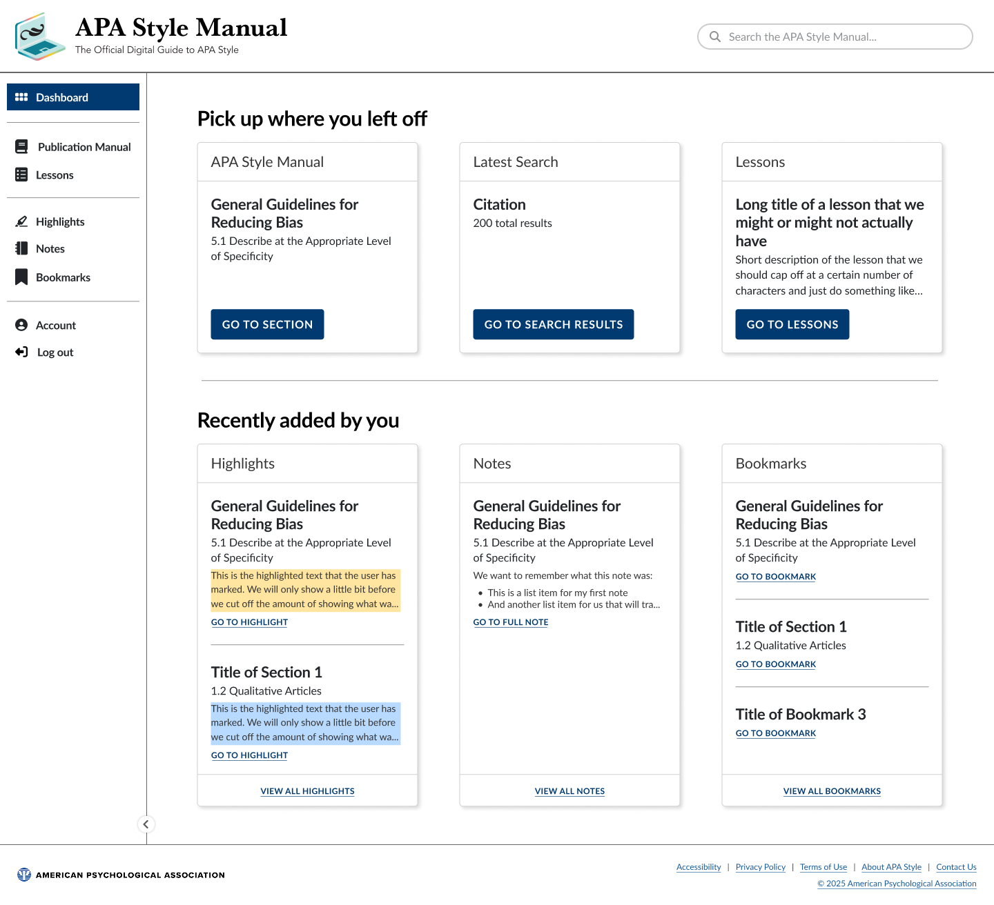
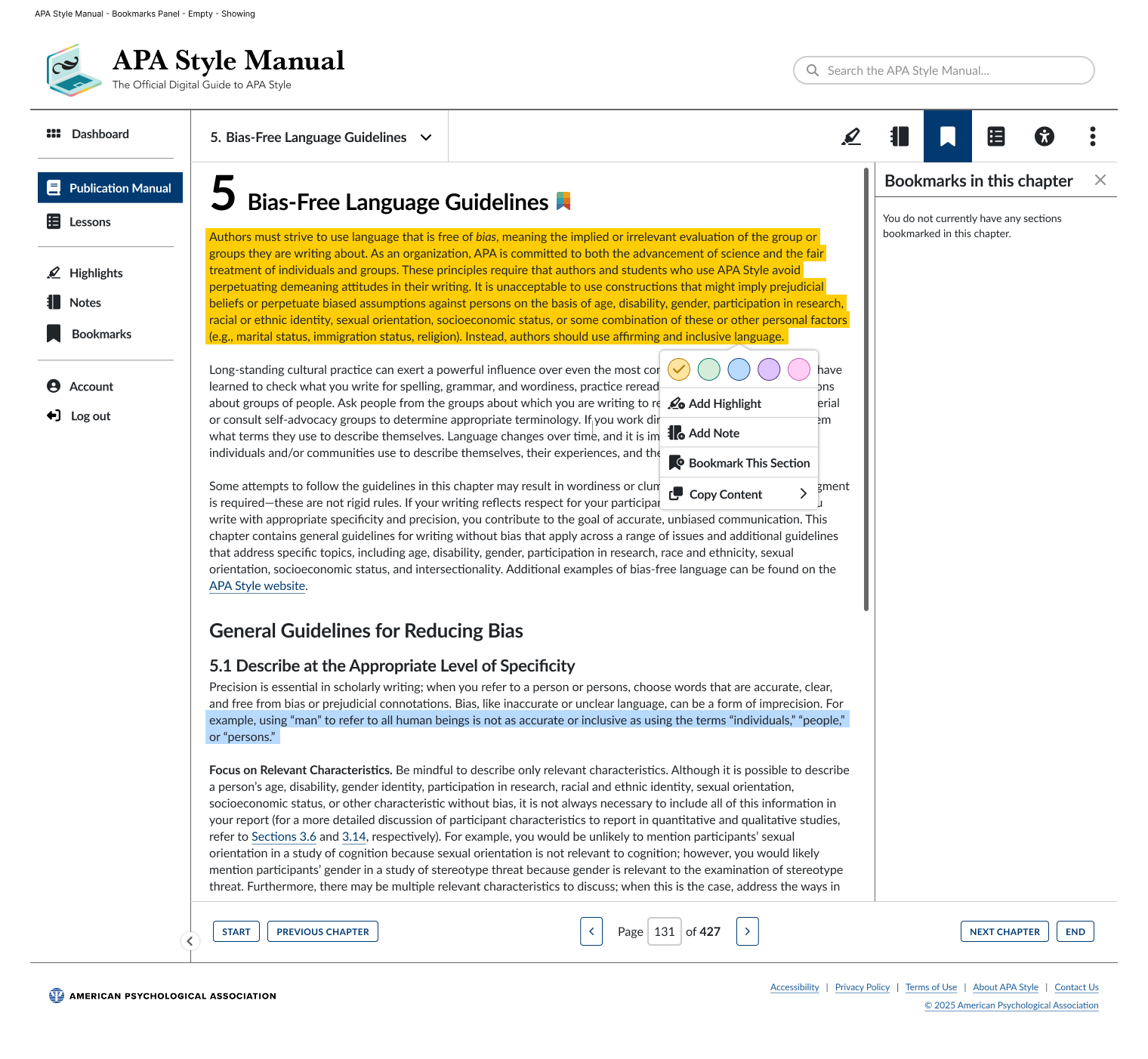
These capabilities came standard with the e-reader platform, but how they were surfaced, accessed, and organized for this specific audience and content was open design territory. This included working through details like where note-editing should live — inline in the reader or on a separate Notes page — a question that shifted based on stakeholder-mediated user feedback during the project.
Mobile adaptation
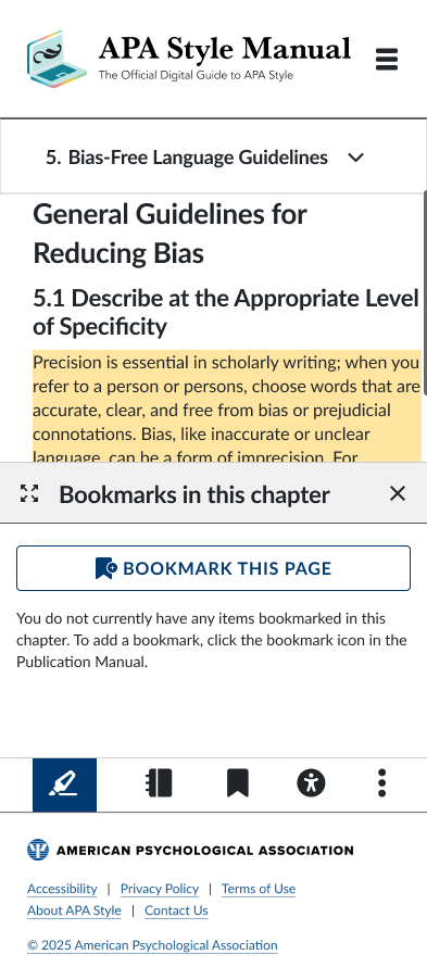
The e-reader platform, like most e-readers, was built with larger screens in mind. Reworking a book-shaped reading experience — plus its interactive tools — into something usable on mobile was the most demanding design problem on the project, requiring rethinking density, interaction patterns, and tool accessibility for a much smaller canvas.
Business-model exploration
Beyond core UX execution, I used research and competitive analysis to help stakeholders evaluate strategic questions outside my direct decision-making authority — for instance, what the product could look like under an individual-subscription model in addition to the institutional model, giving stakeholders information to react to and decide against or toward.
Collaboration & iteration
I worked alongside a small group of developers, a project manager, and content/QA stakeholders who brought deep familiarity with how institutional users — particularly university library patrons — actually behaved. Rather than formal usability studies, validation came through this team’s ongoing review and the feedback they surfaced, which led to concrete design changes over the course of the project, such as the notes-editing placement decision above.
Launch & outcome
The product launched in summer/fall 2025. I was involved through launch — continuing design work, reviewing the build on the development platform, and making sure the intended experience held up in the final implementation. Since launch, the product has seen continued adoption and ongoing feature investment from the team, and the original interaction patterns I designed have proven robust enough to serve as the reusable foundation for later additions, without requiring my direct involvement in every subsequent change.
This was the first time this specific content moved from something people simply read to something people could interact with.
Reflection
This project mattered because it was the first time this specific content — the Style Manual — moved from something people simply read to something people could interact with: searching, bookmarking, highlighting, and annotating it directly. I was involved from a barebones starting point all the way through launch, owning both the day-to-day interaction design and the exploratory strategic questions stakeholders needed help visualizing. It remains one of the projects I’m most proud of, both for its impact on a new institutional revenue stream and for the fact that the underlying design patterns are still doing real work for the team today.